
Project Overview

The goal was to create a comprehensive visual foundation for HMH products, ensuring consistency, cohesiveness, and brand recognition across all digital and print materials. I contributed to multiple projects, and this page showcases some of my work, including the color palette, typography, and button design.
My Role
User Interface (UI) Design: Creating intuitive and engaging user interfaces that were tailored to the cognitive abilities and learning styles of K-5 students.
User Experience (UX) Design: Ensuring a seamless and enjoyable user experience by conducting usability testing, gathering feedback, and iterating on designs.
Skills
User Research
User Experience (UX)
User Interface (UI)
Interaction Design
Accessibility
Design Thinking
Systems Thinking
Achievements
Enhanced User Experience: A more visually appealing and intuitive user experience that is accessible to a wider audience.
Efficient Design Workflow: A streamlined design process with clear guidelines and standards, reducing design inconsistencies and improving efficiency.
Case Study
Saturated Color Palette
While the product teams successfully adapted the core color palette, some encountered challenges with the saturated colors:
Certain shades were disconnected and did not accurately reflect their color names, such as Golden Saturated 40 (S40).
The same color code exhibited varying shades; for instance, Cerise S35 appeared darker than Red Saturated 35.
Darker shades above S40 were not provided for use as text colors.
Creation Process
Saturate 40 (S40) as the color code was the dividing color for dark text accessibility, so I used that as the marker to design and adjust the other color shades.


Outcomes
Addressed the disconnection between similar color shades.
Unified color codes for consistency.
Introduced two additional darker shades for each color.
Added Yellow Green to align with the Core Color Palette.
Ensured color usage met WCAG accessibility guidelines, maintaining a contrast ratio of 4.5:1 for standard and small text, and 3:1 for larger text.
Before

Previous saturated color palette design.
After

Updated saturated color palette.
Case Study
Buttons - Grade K-5
I conducted a research project to identify the best UX and UI practices for younger children (see HMH Visual Language Exploration). I applied these findings in designing buttons for the Math Response to Intervention (RTI) product.
Grade k-2 Button Style

Grade 3-5 button style and state
Button Style Grade 3-5
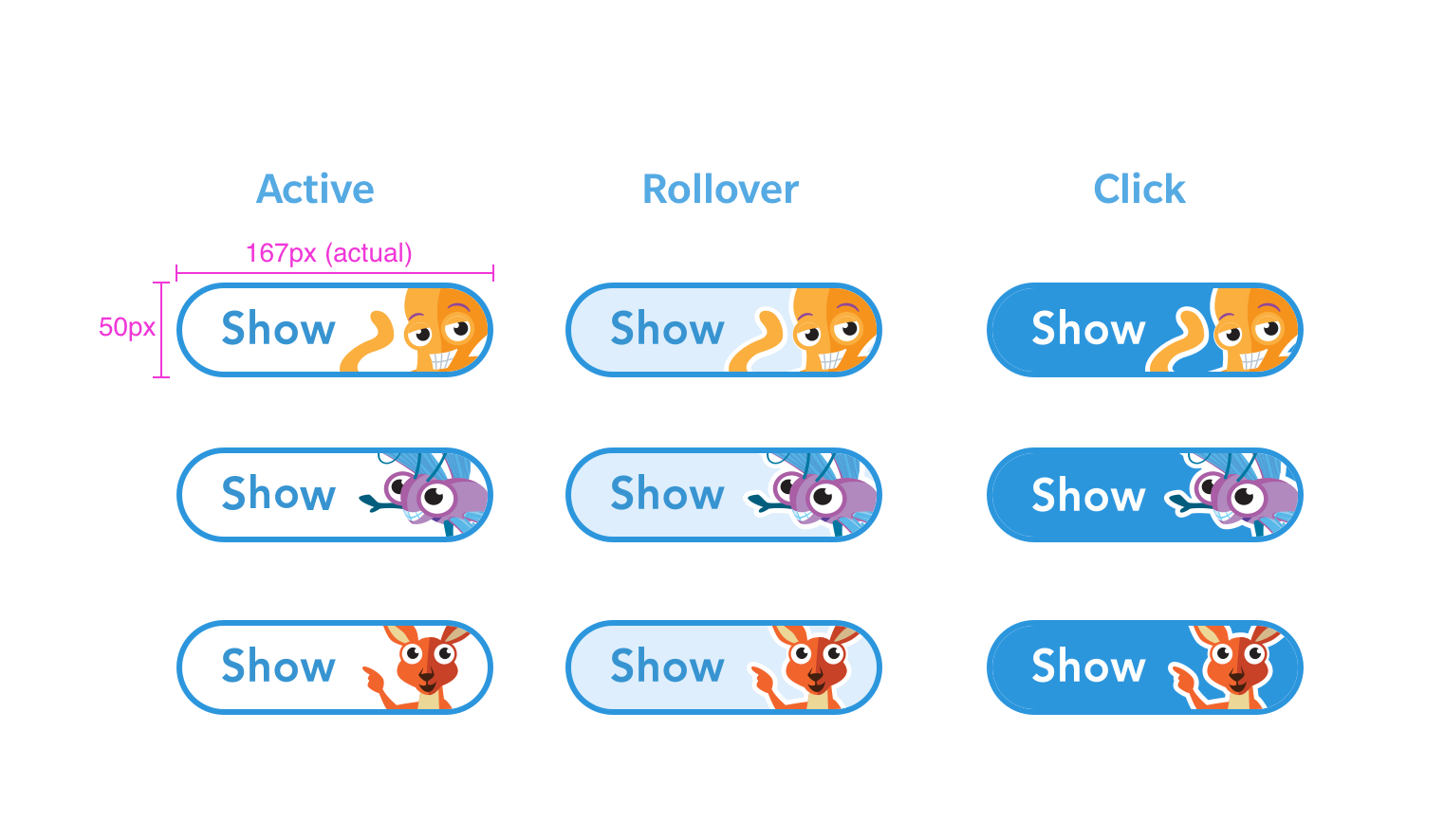
Grade k-2 button style and state
The animal characters on the buttons were illustrated by a member of the Math print design team. I utilized this design to enhance the connection between the print and digital products.
Below is an example of one of the buttons applied to a Multiple Choice Question Pattern.
The button style applied to a single activity platform for Math RTI program.
Case Study
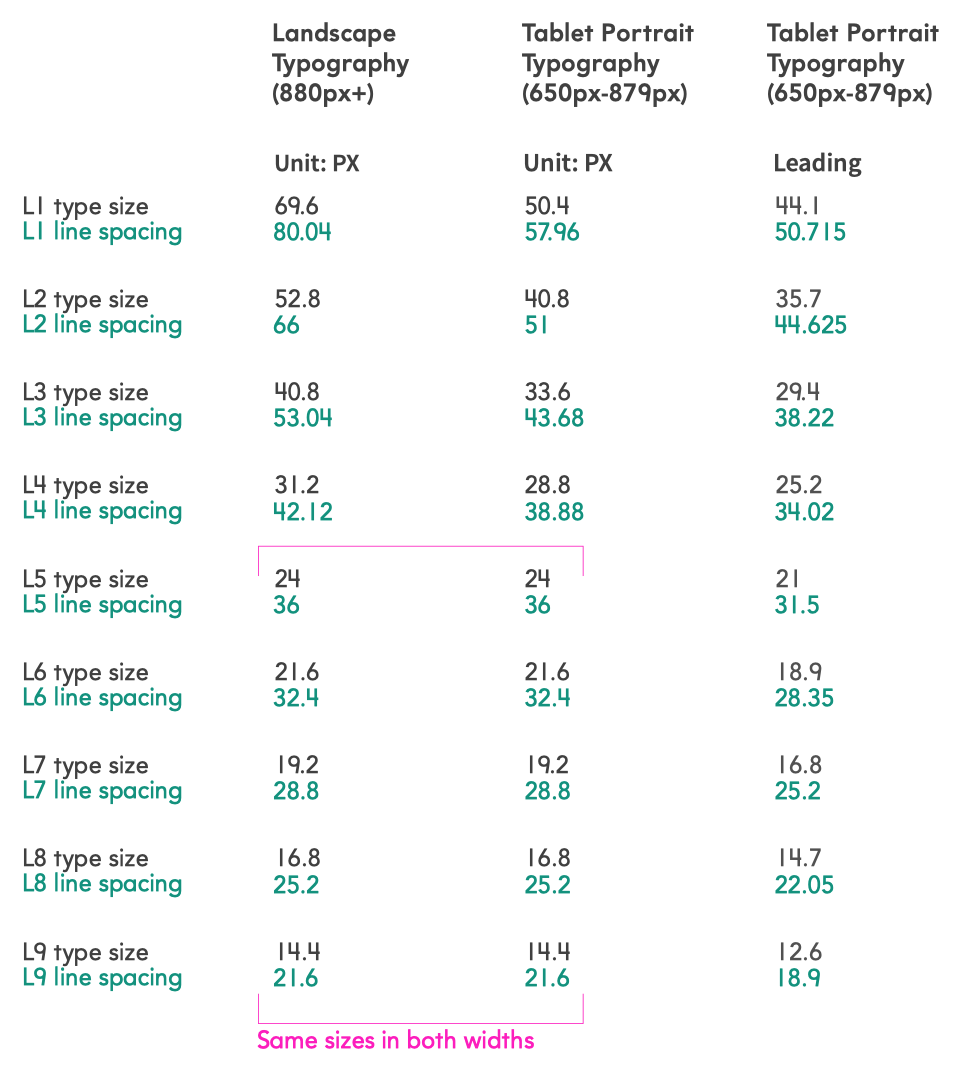
Typography - Math grade K-2
I adapted the original typography from the Design System for HMH Math learning products aimed at K-2 students, customizing it with product-specific font choices, line spacing, and font usage for each grade level.
Default typography system and its limit
AvenirPrimaryHMH was the default font choice for Math programs aimed at younger children. This font features the number 4 with an open top, making it easier for students to recognize and identify the number. However, the existing typography system does not adequately address the reading needs of young children.

Font Size and Line Spacing Optimization
To enhance readability and accessibility for young learners (ages 4-8), I carefully adjusted the font size and line spacing in Level 5 (L5) materials. The default body size was increased from 16px to 24px, ensuring optimal legibility for the chosen font and the target age group. This adjustment contributes to a more engaging and inclusive learning experience for young students.
Result: UI Kit Development
To streamline the design process and ensure consistency across the Interactive Patterns student interfaces, I developed a comprehensive UI kit. The kit was delivered as a Sketch Symbol Library, providing designers with a centralized resource for reusable UI elements. This efficient approach facilitated rapid prototyping and iterative design, ultimately contributing to a more cohesive and user-friendly experience for students.


UI kit design for Patterns that faced to grade 6-12.

Grade 6-8 UI kit sketch symbol library screen shot.