
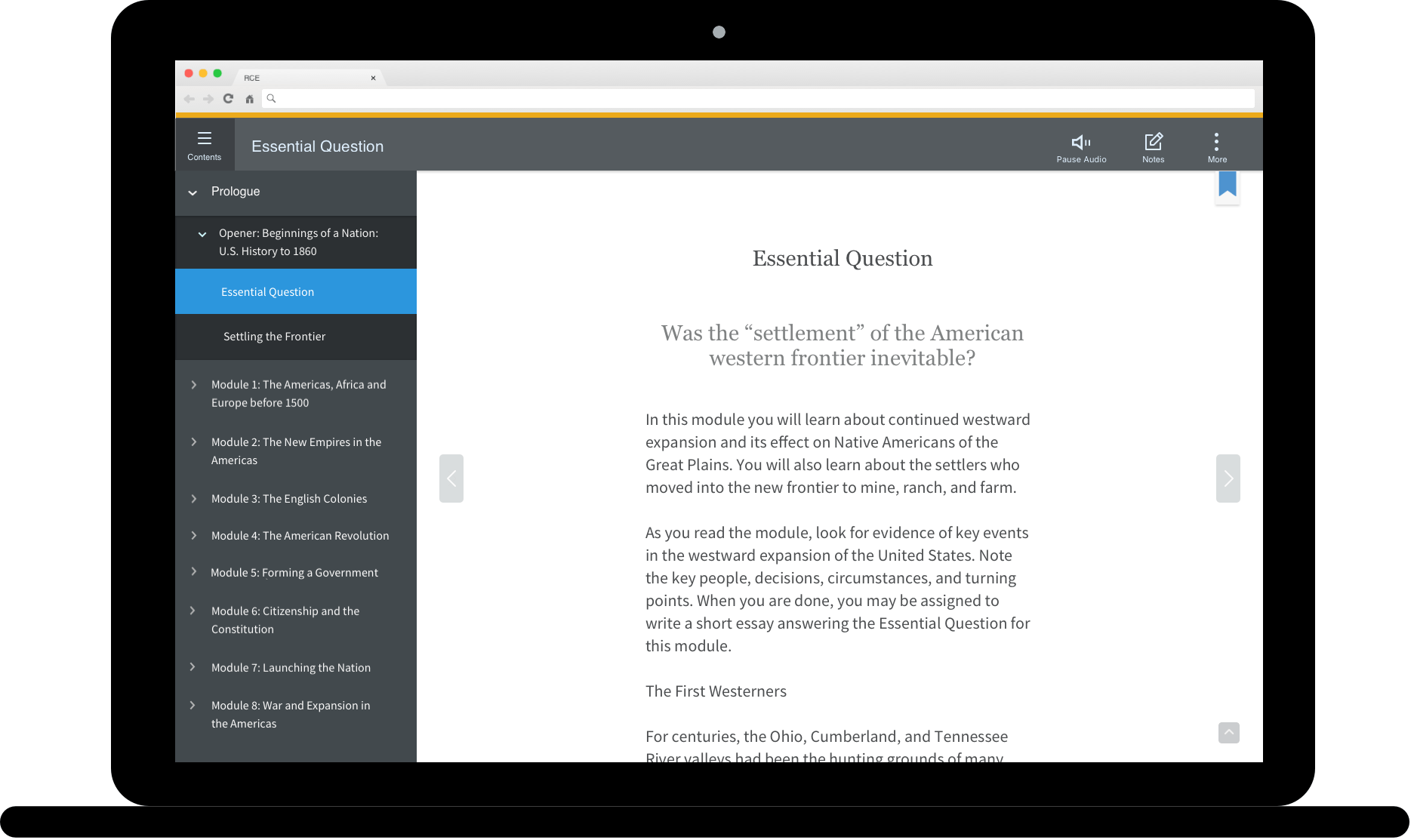
Project Overview
The HMH e-learning platform development met the mid-road map goal. As the next step, I was invited to the project to lead the evaluation and design refinement.
My Role
I led the platform refinement, from user testing to UX/UI design. I worked with a cross-functional team, including learning product owners, learning architects, UX/UI designers, and engineers.
As a UX/UI Designer and Platform Optimization Specialist, I played a pivotal role in enhancing the usability and effectiveness of the RCE platform.
My contributions to the RCE platform project demonstrate my ability to conduct thorough usability testing, establish cohesive design standards, and implement targeted improvements to enhance the user experience and drive project success.
Skills
Design Process and Methodology
Design Thinking
Agile Methodologies
Prototyping
User Research and Experience
User Research
User Experience (UX)
User Interface (UI)
Interaction Design
Information Architecture (IA)
Accessibility
Achievements
Usability Testing and Improvement: Conducted comprehensive usability testing on the RCE platform, resulting in valuable improvement suggestions that were readily adopted by Product Owners, driving the project forward.
Design Style Standardization: Established a unified design style for the platform, including icons and buttons, tailored to the specific needs of students in grades K-2, 3-5, and 6-12. This standardization ensured consistency and alignment with the Ed LMS, enhancing the overall user experience.
Platform Refinement: Implemented targeted design refinements to the platforms designed for grades 3-5 and 6-12, further optimizing their usability and effectiveness for these age groups.


Case Study
Note-Taking Tool
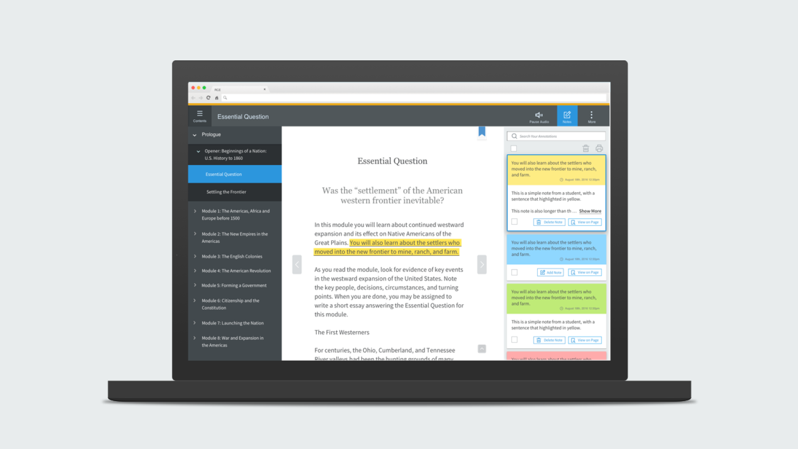
The Note-Taking Tool was seamlessly integrated into the note panel (the right panel of the platform), providing students with a convenient way to capture and organize their notes. I focused on assisting students in effectively highlighting content and taking notes.
Challenges
One of the primary challenges encountered was the need for students to highlight content with four different colors within the same sentence. Unlike traditional highlighting tools, where new colors overwrite existing ones, our tool required students to identify and manage multiple highlighted layers. To address this, I implemented a feature that allowed students to locate highlighted content on both the content page and the note panel, accompanied by an optional note for further context. This solution ensured a more flexible and intuitive note-taking experience.
Note-Taking User Journey

Note-taking user journey.
Define Problems
Based on the user journey, I identified three areas that required design and refinement:
Highlight Pop-Up Window: Update functionality, redefine highlight colors, and improve the View Icon and Add Note Button (from User Journey 3).
Multiple Highlight Indicators: Implement a way to indicate multiple highlights within the same sentence (from User Journeys 4 & 5).
Note Cards: Enable students to edit highlights and notes on a notecard (from User Journeys 6, 7, & 8).
Highlight pop-up window
Iteration 1
To provide students with a visual break from the excessive text and icons on the platform, I designed the highlight pop-up window with this in mind. I initially chose a round-shaped highlighter and icon-only buttons. I separated the highlight and note-taking functionalities into two distinct parts for easier differentiation. The trash can button allowed students to delete both highlights and notes.

Highlight and note-taking design iteration 1.
Iteration 2
Feedback from the Learning Architects indicated that students primarily highlight content rather than take notes. In response, I moved the note-taking trigger to the top, enabling students to easily turn the note editing mode on or off as needed. I also changed the highlighter shape to a square to align it with the underline and note toggle ON status. From guerrilla user testing, I discovered that users were unclear about the meaning of the view icon, so I added text labels to the buttons for clarity.
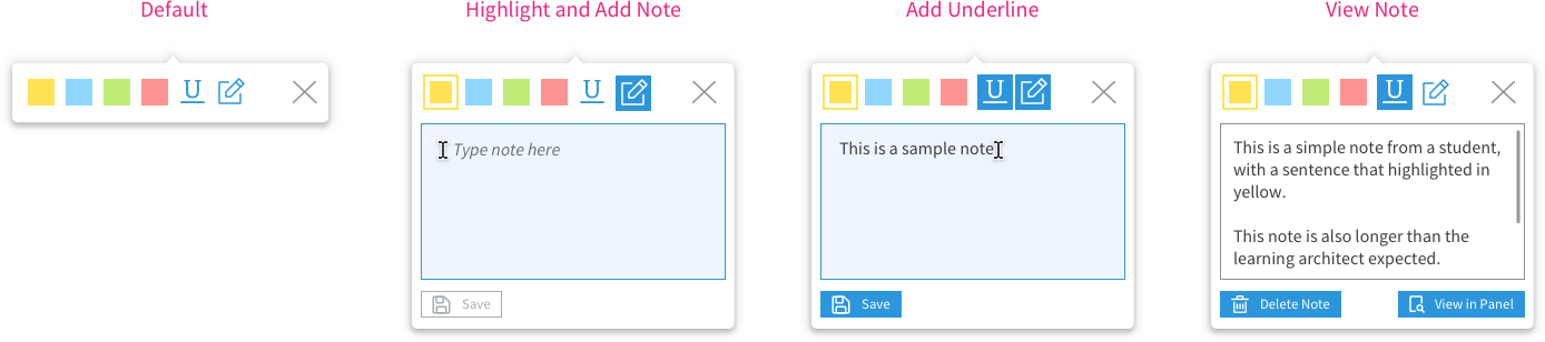
Highlight and note-taking design iteration 2.
Iteration 3: Final UI Design
During the design of stacked note cards on the note panel (see Challenge 3), the filled buttons drew excessive attention and made the note panel appear cluttered. As a final step, I switched the buttons to a secondary style—outlined—to redirect users' focus back to the content, thereby improving its findability.
Highlight and note-taking final design.
Multiple Highlight Indicators
Students required the ability to highlight a single word or sentence multiple times while tracking each highlight on the note panel. In some cases, newly highlighted content obscured previous highlights, necessitating a multiple highlights indicator. I suggested implementing a highlight filter, such as displaying only yellow highlights. For example, an English teacher might instruct students to highlight all verbs in a paragraph using a green highlighter, but this feature was beyond the current development scope.
Indicator Iteration 1 - Number
Due to a technical constraint that prevented me from adding space within the content, I had to utilize the highlighted area. With limited space, my initial design placed a highlight number at the end of the sentence in the top right corner. The font size was set to 8 pt, using a semi-bold weight for improved readability.

Multiple highlights design iteration 1.
Indicator Final UI Design - Marker
As shown in the zoomed-in image, the indicator was difficult to read. The learning architect emphasized the importance of clearly indicating hidden highlights in the content. As a result, the design was updated to a simple 4px dark gray square as the indicator. Students could click on this area to open the note panel and view the details.

Multiple highlights final design.
Note cards
Iteration 1
When designing the note card, I used the highlight color as the background to enhance content visibility among numerous note cards. Additionally, I employed a filled button style, which served as the primary button choice.

Note card design iteration 1.
Iteration 2
When I placed the cards in the panel, I extended the background color to full width to minimize the "Russian doll" effect caused by the existing Note Panel and content padding. However, the filled button style made the panel appear cluttered, so I switched to an outlined button style.

Note card design iteration 2.
Iteration 3: Final UI Design
After refinement, the card still occupied considerable vertical space on the Note Panel, so I relocated the selected button to the bottom of the card to save one line. Additionally, I positioned the Show More button on the right side, which saved another line of space.
Note card final design
Results
Highlight & Note-taking Prototype