
Project Overview
The PTC Web Component Library is a collection of reusable components that empower PTC customers’ engineers to create data-driven enterprise applications through ThingWorx. Designed strongly emphasizing scalability, configurability, and interoperability, the library allows engineers to easily enable or disable features based on their end customers' needs.
(ThingWorx is a leading industrial IoT (IIoT) platform that enables organizations to connect, monitor, and control physical assets in real time. It provides a unified platform for developing, deploying, and managing IoT applications across various industries, including manufacturing, energy, healthcare, and transportation.)
My Role
Design System UX Lead
Built a comprehensive Web Component Library: Led the team in creating a robust Web Component Library; successfully delivered high-quality, reusable web components, including a complex data visualization component for the Industrial IoT platform ThingWoxs, enhancing the overall user experience.
Optimized release planning: Streamlined the release process by prioritizing web component development and aligning efforts with current builds and future initiatives.
Unified web component design: Developed a standardized Design System template adopted by seven product teams, ensuring consistency and clarity across the organization.
Fostered cross-functional collaboration: Facilitated effective integration of the Design System with VR/AR and Kapware product teams, promoting alignment and efficiency.
Cultivated collaboration: Fostered cross-team communication and collaboration, involving over ten teams to identify core components and establish clear design and development requirements.
Skills
Technical Skills:
Web component development
Design system architecture
Front-end development
Data visualization
Design thinking
User experience (UX) design
Accessibility
Soft Skills:
Design Leadership.
Collaboration
Communication
Problem-solving
Strategic thinking
Adaptability
Case Study
Schedule Chart

Schedule Chart mockup
The Schedule Chart is a variant of the Bar Chart. Initially, the product owners requested five charts, including a Gantt Chart, Bar Chart, and Line Chart, to be designed within two months. After assessing user needs and evaluating the design and development effort, I adapted the Gantt Chart into a Schedule Chart to better meet those requirements and deadlines.
Challenges
Challenges for the Schedule Chart:
Implement multiple zoom controls to enable users to focus on specific data durations.
Allow users to view detailed information for each data point.
Provide real-time data visualization.
Additionally, all web components needed to:
Support at least four smart products to ensure scalability, configurability, and interoperability.
Clearly convey enterprise product identity, operational model, and state for assistive technologies.
Adhere to ARIA Authoring Practices to ensure accessibility.
Prioritization
I gathered the prioritized component needs from the product owners of the four smart products and engaged in discussions with their designers and primary users (builders) about the design requirements. I then synthesized this information with our existing components to create a narrowed-down list in collaboration with my product owner and technical program manager for the upcoming release planning.
Research
Here’s an overview of the research process I conducted to capture and understand the scope of building a Schedule Chart and how it can meet the needs of the product teams.

Research process
Feature Scoping
I used the research findings to align with the group product owners' business needs and then discussed the outcomes with my technical program manager and engineers to outline the design and development work.
My approach typically begins with sketching the overall structure and breaking it down into components, followed by creating a list of dependencies.
Anatomy: A parent-child structure that organizes each feature and presents available customization options.
Dependency List: A comprehensive functionality list that highlights existing patterns, identifies areas for expanding pattern functionality, and outlines new pattern design and development requirements.
Anatomy
I applied the Atomic Design methodology to establish a parent structure that laid out the containers of content and features'. The goal was to visualize the placement.
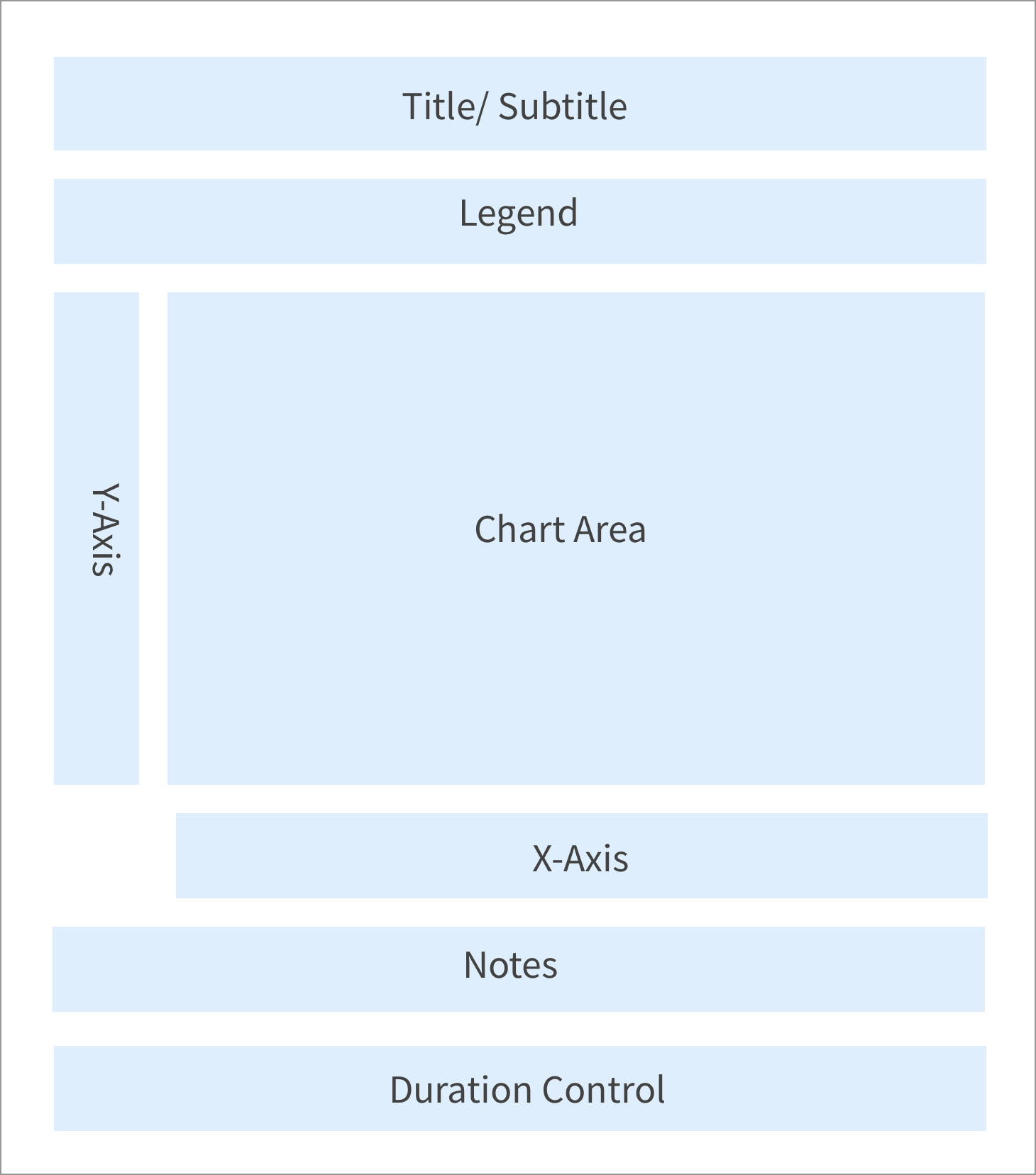
Schedule Chart parent structure
Child Structure - X-Axis
I visualize the implementation effort by outlining which dependencies will be utilized in each child container. This approach aids in generating the dependency list.

Schedule chat X-Axis (Timeline) structure
Dependency list
The generated list was shared with the development team and included existing dependencies, their expansion and update needs, as well as a list of new dependencies. This comprehensive list enabled the technical program manager and engineers to estimate the effort required and coordinate the work between components.
Most importantly, it provided the TPM with the information needed to determine what to prioritize for development.

Schedule Chart dependency list
Behaviors Design
Numerous factors had to be designed and considered for each dependency in the Schedule Chart, including keyboard interactions, mouse and touchscreen gestures, and text-overflow for the legend. The examples below illustrate the Duration Control's assemblability, micro-interactions, interoperability, and responsiveness.
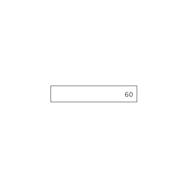
Assambability
I began by showcasing the individual dependencies and then presented combination options for the Design Systems engineer to implement. The results provided the flexibility and customizability needed for builders to create Duration Controls tailored to their specific data and customer requirements.
Single Dependencies
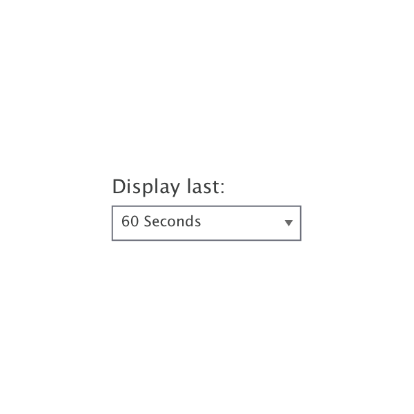
Drop Down

List
Text Input

Date & Time Picker

Slider

Button
Assembled Dependencies
Certain dependencies, such as a text input and a button, cannot function independently; they must combine their capabilities with other dependencies. While some dependencies can operate on their own, their combinations often enhance accuracy for the end user. For instance, pairing a Date & Time Picker with a Slider enables users to view a specific day within a one-hour duration, provided that the relevant data is available.
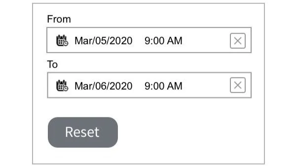
Date & Time Picker + Button
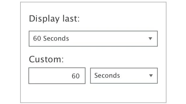
Drop Down + Text Input
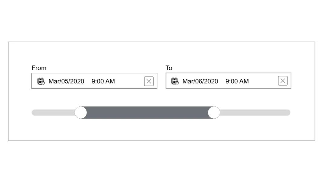
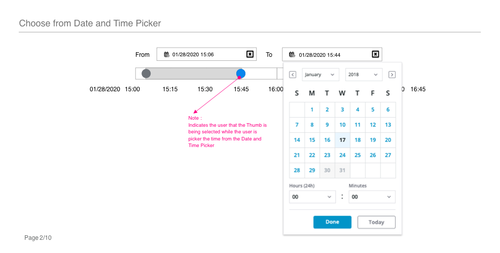
Date & Time Picker + Slider
Interoperability
Each web component can utilize previously built dependencies, such as a button, but these dependencies may not always meet new requirements.
For instance, the Date and Time Picker can be reused in various contexts. In the Schedule Chart, the time may need to be precise down to the millisecond. Depending on the bound data, certain times may need to be disabled for end users. In such cases, the previous build must be updated to accommodate the new usage scenarios.
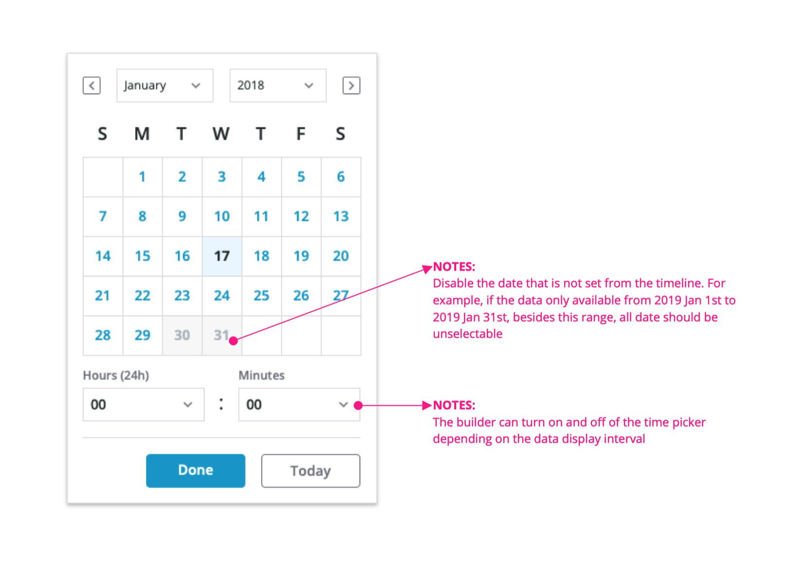
Date & Time Picker new functionalities added for Schedule Chart
The Slider was originally designed for value display but was adapted to function as a Duration Control in the Schedule Chart. It required enhancements for greater accuracy and needed to integrate effectively with the Date & Time Picker.
Slider component functionality update for Schedule Chart
Micro Interaction
"I do not want to keep reading the same information on a chart and think it is important data, especially the time!"
Builder’s feedback
Based on feedback from builder interviews, I introduced time formats with truncation details to address the redundancy issue.
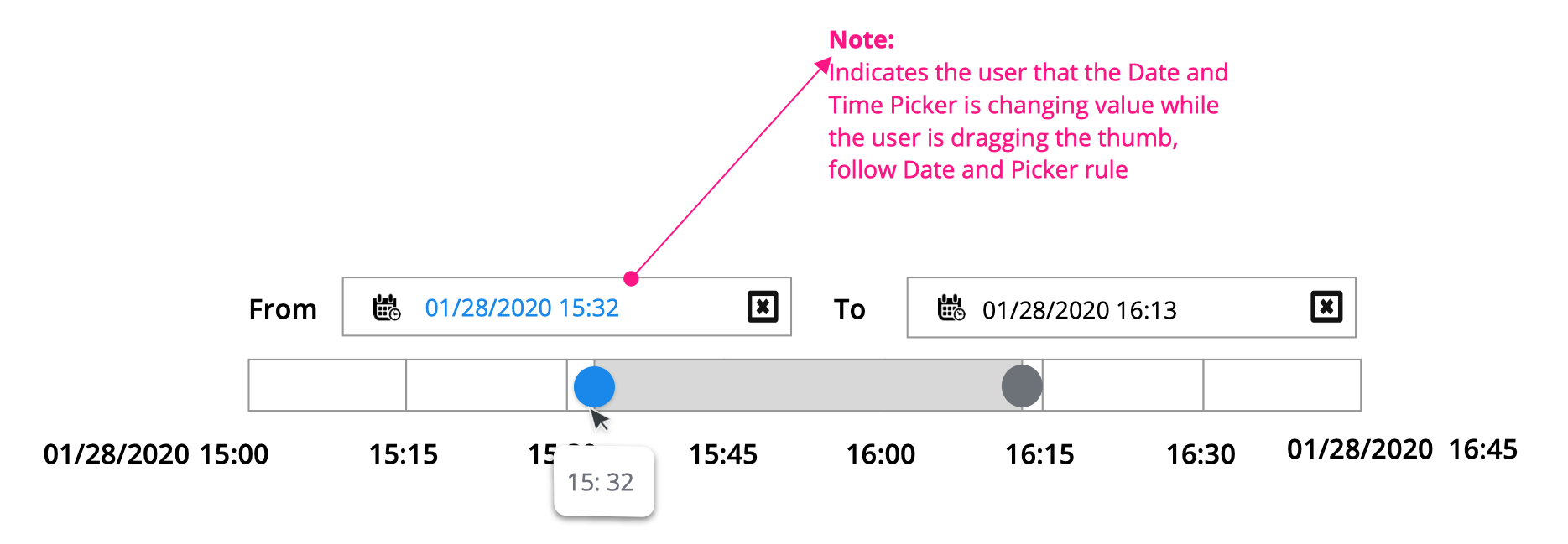
The example below illustrates the micro-interaction designs for the Slider and how it utilizes tooltips to display time.


Responsiveness
Each dependency must be adaptable to fit small, medium, and large containers, whether displayed on mobile phone screens, laptop screens, or within a dashboard container.


Property list
Properties enable builders to customize and style the elements. Considering the builders' engineering backgrounds, I collaborated closely with a technical product designer to identify the often extensive list of user-configurable properties.

Property list and the display on the platform
Results
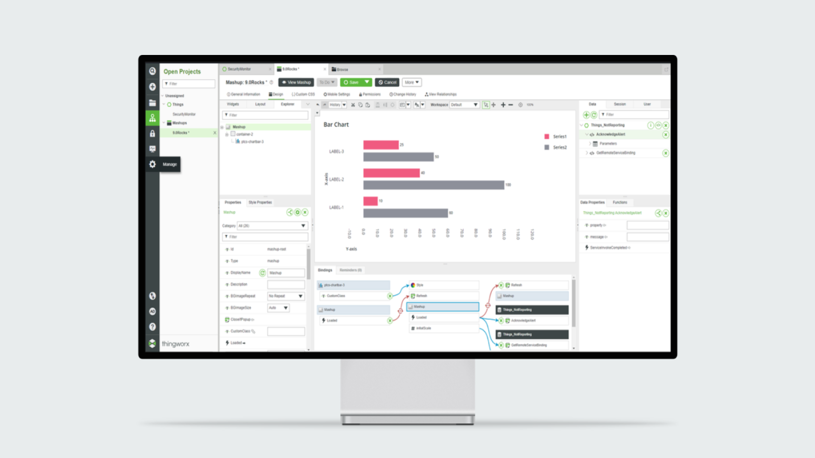
As a result of this process, my Design System team successfully met the business needs of the product owners. We delivered the features that builders were seeking, enabling them to create a Schedule Chart quickly upon binding their data with the default settings.
Ultimately, we enhanced the functionality of three existing dependencies and developed an additional dependency.

Creating a schedule chart on ThingWorx platform.
Result & Impact
Result:
Led the design system team to develop a comprehensive Web Components Library, streamlining the development process and ensuring design consistency across PTC's diverse product portfolio.
Impact:
Enhanced efficiency: Delivered 9 data visualization components within 10 months, empowering builders to rapidly connect real-time data to dashboards.
Improved consistency: Established a unified design language across PTC products, improving user experience and reducing development time.
Fostered innovation: Introduced a collaborative style, fostering a culture of creativity and innovation within the design team.